
Our Rebranding in Words and Colors: Testimonials from the Team That Shaped Our New Identity

Welcome to the behind-the-scenes of our reinvention! Step into the backstage of our recent transformation! In the following interviews, get a firsthand account from our team members who played a pivotal role in reshaping our brand. Dive into the story of the employees who infused their energy and creativity to redefine our brand. From within, explore the motivations, challenges, and joys that marked this thrilling journey.
Discover the secrets behind Deezer’s rebranding and new brand identity with testimonials from Maria Garrido, Arnaud Roulleau, Rowan Standish Hayes and Sofia Oberhoff.
Maria Garrido, Chief Marketing Officer

Can you introduce yourself and tell us what is your role at Deezer?
Maria Garrido, Chief Marketing Officer, Deezer.
You’ve decided to do a rebranding. Why ?
At Deezer, we’ve made a strategic shift towards a new brand purpose; ‘Deezer helps you be and belong’. We believe that our unique space in the world of streaming platforms is to go beyond streaming to give fans, artists and partners an opportunity to be (express themselves) and to belong (connect with others) through our product and services.
Refreshing our visual identity is a necessary step as we enter a new age for Deezer. It gives us an opportunity to tell our story in a more emotional way, connect with music fans, artists and strategic partners alike through visual cues that let people know that with Deezer, they can live the music, not just listen to it.
“let people know that with Deezer, they can live the music, not just listen to it“
What do you hope this new identity will bring?
Maria Garrido: This new identity is an opportunity for us to articulate our vision, helping people be and belong, but also to express our own unique personality: Bold, Fresh & Quirky. We hope that this new identity refreshes interest in our brand and communicates our desire to bring music to life, celebrating the value of connection and expression through music.
How will it bring “fans, artists and your partners” together?
A new visual identity is a big part of a rebranding exercise, but not the only one. As our vision is to create an experience services platform around all things music, our focus in marketing will be on highlighting the music experiences and content that matter to fans, artists and partners. This includes features like FLOW, Music Quiz and Shaker, which give people a chance to express their moods through music and connect with their friends, even outside of the Deezer product, around music.
Our events and content give fans an opportunity to live experiences with their favourite artists and give artists an opportunity to express themselves and grow their audience. Our ambitions for strategic partners is that Deezer helps them connect with their customers in other meaningful moments of their lives.
At its core, our rebranding is all about the idea that Deezer is really unique in the DSP world as the brand where people can truly live the music.
Arnaud Roulleau, Head of Creative Studio

Can you introduce yourself and tell us what your role is at Deezer?
My role is Head of Creative Studio and I’m responsible for the creative and design aspects of the Deezer brand, from strategic vision to its final realization.
How did you define Deezer’s new visual identity? Can you explain the design process?
It all started in July 2022. We conducted an internal audit to identify weaknesses in the brand’s visual identity. This in-depth analysis highlighted several problems.
Firstly, the graphic vocabulary was not conducive to developing a strong brand ecosystem. It was impossible to create consistency across activations — emails, advertising campaigns, banners, playlist covers… It was challenging to achieve the brand attribution we wanted when the only visual element was a logo. On the subject of colors too, Deezer suffered from a lack of consistency in its palette across product and brand. Finally, our only graphic USP was the gradient, which was already being used by a large number of direct and indirect competitors.
Going back further, Deezer was initially created by developers with a passion for music. These tech roots have contributed enormously to the brand’s identity over the years, but the existing system lacked personality and didn’t allow us to cultivate and transmit the emotion our customers wanted to connect with. Last but not least, the identity was no longer in line with the brand’s new positioning. A new Deezer had to be born.
The redesign was launched. We mapped out all the brand’s contact points to ensure that the new identity would meet all our needs for expression. We spent a lot of time drawing up an extremely detailed brief, from both strategic and technical points of view. High levels of precision mean equally high levels of freedom.
“High levels of precision mean equally high levels of freedom“
We then set out to find a partner who could help us rise to this ambitious challenge. We met with several branding agencies from the four corners of the world, including Brazil, London and New York. To say it was love at first sight would be going to far, but let’s just say that the Londoners at Koto won us over straight away. They immediately understood the objectives and challenges of the rebrand. Their interpretation of our positioning led to an extremely strong proposal from the outset. Koto has a solid track record. From a creative point of view, they have an incredible ability to create impactful identities and find the small detail that will make all the difference. Their well-constructed approach, their sense of storytelling and their ability to put images into words have helped to unite our teams around our core project. By involving all employees in this new brand vision, each employee became an ambassador for our new identity.
The systemic approach across our collaboration enabled us to deploy the identity with coherence and harmony across all the graphic elements in the system (typography, illustration, icons, etc.). We were very demanding with them as we were keen to find substance in each element and to justify each choice and composition in order to identify the fundamental principles needed to frame the system. We had to ensure it was well adopted both internally and by our partners.
Then came the real collaborative work with the Product Design teams. This time, it was important for the brand to be expressed consistently throughout the user journey, but particularly on the app. We therefore involved the Product Design as early as possible in the rebranding process, so that the UX/UI constraints were taken into account from the start.
At the beginning of August, we began to roll it all out. The start of a race against time. Designers, copywriters and creative managers were all on the go, gathering information about the needs of each division and ensuring that everything was delivered on time. Applying guidelines is a demanding exercise. Maintaining the fidelity of the system as it is deployed requires a great deal of exploration and reflection. But this process also allowed us to test the flexibility of the system across all the key touch points.
Then, on 7 November, our new identity was unveiled for the world to see 🙂
What are the objectives of this new identity in the brand’s graphic strategy?
There were multiple objectives. As the guardians of our brand identity, our main objective was to reconnect with our users and non-users by telling a uniquely Deezer story, to rediscover the emotion and passion that Deezer seemed to have lost a little over time.
As a manager, my aim was to provide my teams with the visual tools they needed to tackle a variety of subjects on a daily basis, without losing the creative spark. The possibilities offered by our new typography, illustrations and motion design are endless and they are ready to be deployed. It’s vital to stimulate the team’s creativity to prevent monotony, while maintaining graphic consistency across a wide range of initiatives. Graphic consistency means telling a rich and harmonious story across different media and communication formats, not simply repeating the same image over and over again.
What has been the most challenging aspect? The most stimulating or satisfying? Can you tell us an anecdote that illustrates this?
Building a brand’s graphic identity piece by piece is already an extraordinary job to take on. Having to do it in two months adds a dose of adrenalin to say the least. Design work is somewhere between architecture and goldsmithing. We spent weeks diving deep into subtleties, contemplated 963 different typefaces and compared 25 different shades of purple. We got the chance to meet and work with passionate and exciting people. Looking back, I’m not surprised that the end result of all this work is a heart.
For my personal anecdote: we initially asked Koto to develop 2 routes, an “evolution” of the current identity with the equalizer logo, and a more ambitious track that we modestly called “revolution.” When these two routes were presented, the approaches taken were radically different but both responded perfectly to the brief. What’s more, the various user tests we carried out revealed strengths and weaknesses of both scenarios. Doubts began to creep in.
” Design work is somewhere between architecture and goldsmithing”
The next day, we needed to present our recommendation to the management team. Coincidentally, that morning my partner and I had a medical appointment. The ultrasound scan for our second child. I remember seeing that little heart beating on the screen and immediately recognized the power of the heart as a symbol. The wave of emotion created by that little organ beating immediately removed any doubt from my mind. Nothing else so clearly symbolizes life, passion and belonging.
An hour later, the revolution route was chosen and the heart became our new logo (Netflix, I’m open to receiving script proposals).
What do you like best about the new brand identity?
That’s a difficult question! I really like the richness and flexibility of the system as a whole. For example, I find the graphic motifs captivating. Not to mention the illustration principles, which I’m delighted to be getting back to. Our illustrator is extremely talented (shout out to Daniel Batista!). I see a lot of potential for evolution.
Despite all the successful aspects of the rebrand, if I had to make a choice I would say the typography work stands out the most. It is the product of a lot of discussion and fine-tuning. The designs are really harmonious and you can see the whole personality of the brand in the letters. You can even find the elliptical shapes that are characteristic of our logo in subtle and elegant ways. Our typography alone is reminiscent of the brand and its world.
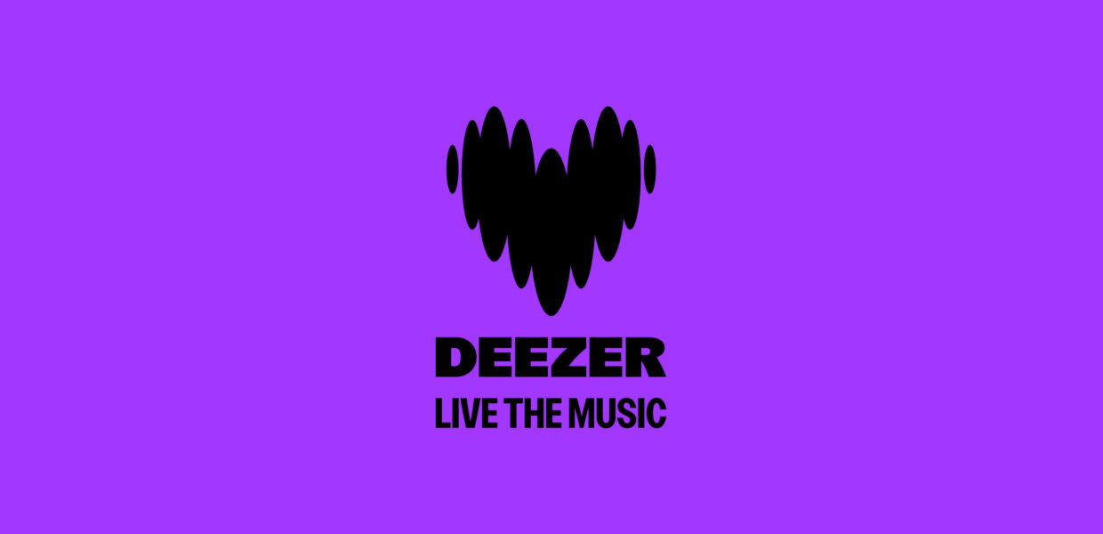
“Deezer, Live the Music”: what does that mean to you?
Les Rita Mitsuko, Singing in the Shower
Rowan Standish Hayes, Lead Creative Copywriter.
Can you introduce yourself and tell us what is your role at Deezer?
I’m Rowan, the lead creative copywriter at Deezer in Paris.
What was the challenge of the copy strategy around the rebranding?
We have a broad audience and in the past our copy has sought to be all things to all people. The first challenge of the rebranding was to establish a clear tone of voice based on our new brand personality. The voice itself needed to be well-defined and consistent, with the tone free to adapt to different contexts.
How do you connect the 3 new pillars Bold, Fresh and Quirky with the brand Deezer?
Our three new personality pillars describe who we are today and nudge us to where we want to go. Being bold is about honoring our roots as a pioneer company and carrying that spirit forward. Fresh is what people expect from us as a culture-driven tech company in the here and now. Quirky is about having the courage to embrace our flaws, make mistakes and explore our potential with a playful, free attitude.
How do these pillars translate into the brand’s creative strategy?
Together, these pillars act as directives for our teams. For each message, campaign, feature or product, we consider whether we are fulfilling the brand purpose based on a cultural/ audience insight, then run it through our brand personality and adjust based on the context. We ask ourselves: is this really bold enough? Does it feel fresh? Could a touch of quirkiness make the difference? By doing this exercise, we sharpen our instincts together and ensure our approach stays on brand. The brand personality pillars sometimes push us to go further and they sometimes act as a harness that pulls us back to our core selves.
“is this really bold enough? Does it feel fresh? Could a touch of quirkiness make the difference?“
What do you like best about the new brand identity?
I love the fact that our new personality doesn’t feel like any other brand in the space!
Deezer, Live the Music: what does that mean to you?
It’s a reminder that music is about way more than just listening. Streaming is one way to live the music but there are many others: dancing, playing, watching, singing…
Sofia, Head of Global Marketing

Can you introduce yourself and tell us what your role is at Deezer?
Hi! I’m Sofia and i’m Head of Global Marketing.
What are the goals of this new identity in the brand strategy?
Way back when we began working on campaign ideas, we knew that our brand faced certain challenges. But really hearing it from people was what had the biggest impact on me. In the focus groups we organized in France it became blatantly clear that the Deezer brand had a big problem: people thought it was outdated. Rightly or wrongly, the impression many people had was that Deezer had not evolved or changed in 15 years since its days as a pioneer music streaming site.
It was clear we had a big challenge ahead of us. We needed to change the brand perception and our brand image. It takes courage to solve a problem if that problem lies at the heart of your brand — a brand that many people love — but we had to show people that we we’re not the old Deezer anymore. We had to shock them by doing something new to discard a perception we didn’t deserve to have.
“we had to show people that we we’re not the old Deezer anymore”
Another problem was that we knew people didn’t feel particularly passionate about Deezer. We were doing loads of great stuff but we always struggled with brand attribution. So, one of the key parts of the strategy was to improve this, to increase brand love to support a new communication platform that spoke to the new identity we wanted to convey. It was a logical choice — a clear strategic direction towards unveiling the new (and the real) us that started with taking the bold decision to change. But it had to be backed by data at every stage.
What was the most stimulating/satisfying thing to work on during the rebranding? What was the most challenging topic around the rebranding?
We took a very strategic, data-driven approach. The agency had a significant amount of insights from the beginning — we gave them our research on the target market, our reports on the brand trackers and our internal interviews. We had a pretty good idea of what was relevant for our brand so we gave them a great jumping-off point.
In building the new communication platform, the agency’s work was split into 3 main areas. It looked at: what really matters to consumers today, what characterizes the music industry and what is at the heart of the Deezer brand DNA. They then established routes based on that framework and the one we connected with most was linked to the industry itself.
Music is now treated like a commodity. Streaming has done great things for music access but it has also taken us away from what people really want from music. They have an emotional relationship to music, they want deep connection with artists and other people. People really feel deeply about music and, here’s the thing, Deezer does, too! We are hugely passionate about music and that is why we develop and build experiences every day. We already have what we need to connect more deeply to our users because literally every employee has a deep passion for music. “Where music comes to life” was born from that realization: we need to show people who we really are.
What was the most stimulating/satisfying thing to work on during the rebranding? What was the most challenging topic around the rebranding?
The most stimulating thing was to see the potential in the new visual identity, to realize what we can do with it from a marketing perspective. When we started to see how it all came together — the logo, the font, the system of symbols and icons — it made my marketing heart so, so happy. I knew that once we installed this in our comms it would immediately help to improve brand attribution. In the marketing department we knew we had been dealing with a problem of consistency (not only visually speaking, so the job is by no means finished), but it was beautiful to see such a good-looking identity come together that would help us with that.
The most challenging aspect of the rebrand was, for me, managing internal communication. Big change brings strong reactions and that is perfectly natural. It can be daunting but it also tells you that you are on the right path. We had a problem with a lack of passion for the brand and our new identity left nobody feeling indifferent, that’s for sure! I wasn’t worried about going live, I wasn’t worried about public perception, but it was a challenge to manage internal communication in the best way. We took a lot of time and an empathetic approach to getting it right. It was about going back to fundamentals, data, and asking for their trust through this process. We knew this was a big change, so we understood there would be conflicting views and we are so grateful that the company could come together to support each other in navigating this moment of change.
What do you like best about the new brand identity?
I love the visual identity. When the teams started working on it, the more I saw it the more I liked it. It all looks fresh, bold and consistent. From a user perspective as well as a marketer perspective, it is very satisfying. We needed this big change and I love that It has LOVE at the centre of the iconography! It contains really strong logic but the symbolism is also so powerful. These shapes construct everything else and it is all connected to who we are as a brand. I have to admit that purple wasn’t my favourite color before, but it looks great on us!
I love purple on Deezer!
Deezer, Live the Music: what does that mean to you?
At Deezer, music is our everyday life. “Live the Music” really digs into our brand DNA and describes our mission to help others live the music, too. Music streaming has traditionally been a seen as solo endeavour, but because we know that people crave connection, we will always treat our product as a point of connection for people. We know people want to live the music together and we feel the same way!
That is why we are building what we are building. So, when we say live the music, we really mean it. Music is meant to be felt, lived and shared. I really feel these words deeply and they are at the heart of the Deezer story.
To read on the same subject: